Help Sellers With Built-Ins
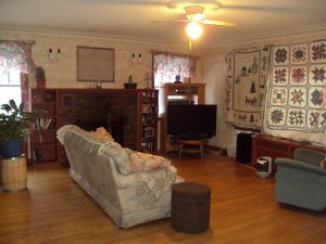
Bookshelves and cabinetry incorporated within a home’s architecture once was equated with grandeur, offering homeowners the opportunity to showcase personal treasures and knickknacks. But over time, the pieces may look dated. Here are updated ideas with pizzazz that buyers may love.
Built-in cabinetry, whether part of a home’s initial design or added to organize and display books, artwork, or knickknacks, has long offered a way for homeowners to introduce a distinctive look to their interior. But with the rise of digital media and minimalist decor, buyers these days may have less of a need for this once widely coveted storage feature.
In addition, pieces constructed years or decades ago may feature materials, hardware, or ornamentation that now looks passé. Even newer units designed to house entertainment equipment—hugely popular in the ’80s and ’90s—look dated thanks to wall-hung flat-screen TVs, wireless speakers, and streaming music apps.
Sellers can usually remove built-ins without causing structural problems, but the process of ripping them out, hauling them away, and patching and painting newly exposed walls, floors, and ceilings is expensive, says Chicago designer Mitchell Putlack: “I recommend leaving them unless they’re so outdated. In most cases, they can be remodeled.”
But even when sellers choose to leave them in, questions may arise about how to improve their appearance. You may even want raise the subject with seller clients. “You don’t want to create an awkward discussion point with a potential buyer about how they’ll be handled,” says Jennifer Howard, owner of JWH Design & Cabinetry in suburban New York. Here are five changes you can suggest to give built-ins a new, hip lifeline.
Paint or restain. When a house has similar architectural details to the built-ins, simply freshening up the look with an updated paint color or a lighter stain can be an eye-catching, inexpensive solution, says Decorating Den designer Sandy Kozar of Knoxville, Tenn. Try a color that matches the trim in the room for continuity, says Howard. Generally, painting is less expensive than staining, says Putlack. But always go with quality paint in a semigloss or gloss finish that can withstand the wear and tear of books and other storage, says Chicago designer Jessica Lagrange of Jessica Lagrange Interiors.
Remove elaborate pilasters and molding that don’t fit the home’s style. Although such millwork was probably lovingly crafted, it may be too fussy for buyers who lean toward simplicity. Removing any over-the-top embellishments and leaving the rest of the built-in requires minimal touch-up work, says Putlack.
Change hardware. An easy switch-out is replacing knobs or pulls. However, these trends typically change fast, so make sure you’re up on the latest looks. Brass has become less popular in recent years, though washed brass is making inroads. Two finishes on the chic list nowadays are polished chrome and satin nickel, says Kozar. Often the shape of the hardware makes a big difference in the impression it leaves. Long skinny pulls have a more modern feel than round or octagonal ones.
Change or remove cabinet and drawer fronts. If doors are overly ornate for the space, Jody Goodman Dinan, a salesperson with The Dinan Team of Coldwell Banker Residential Brokerage in Boston, often suggests switching them out for flat or Shaker style panels. Homeowners can also remove fronts entirely and finish the resulting edges, turning closed cabinetry into shelving. Designers at Chicago custom home builder BGD&C find that running shelves high on a wall offers a feeling of grandeur, while keeping the shelves open offers a greater sense of scale. A rolling ladder offers an eye-catching way to access the uppermost reaches.
Install lighting. Adding bulbs at the top or sides of shelves can highlight displays and add drama. And by using battery-powered LEDs, homeowners can often avoid hiring an electrician. Select bulbs that work on dimmers to vary light levels and moods, says Lagrange.
When sellers don’t want to undertake this effort and expense, consider suggesting they include a computer-generated rendering or blueprint drawing that shows buyers how the room can look with any of these changes, says Dinan.
September 2017 | By Barbara Ballinger-Realtor Magazine


